THE ORDER OF FIRE

Brand & Design System
Edition I · Prepared for the bvlls
00

This document sets down the visual law of the Order: the mark, the metals, the letterforms, and the materials from which every record, seal, and gathering artifact is built. Consistency here is not decoration. It is how the Order recognizes itself.

Mythic

Every surface treated as ritual object, not corporate collateral.

Grounded

Weight comes from restraint. Nothing florid, nothing weightless.

Sparing

Gold and fire are earned accents, not defaults. Use them like flame: briefly, deliberately.

01

The Mark

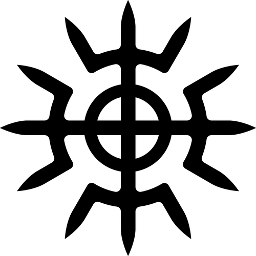
The mark of fire and vajra, set in a bronze medallion. It stands for the Order the way a name stands for a person: not decorative, but load-bearing.

Construction

The mark represents both fire and vajra. Its horizontal line is the delineation between the earth and the divine ideal; its vertical line is the bridge between them — men born of the earth, aiming ever upward. Where the two meet is our axis mundi.

Minimum size

Never render the medallion smaller than 28px / 0.4in. Below this the flame tines lose separation and the mark reads as a smear, not a symbol.

Clearspace

Maintain clearspace equal to the height of one flame tine (roughly 20% of the medallion diameter) on all sides. Nothing else, no wordmark, no rule line, no photograph, crosses this boundary.

On dark, on light, in metal only, on color

On dark

On light

In metal only

On color — Instagram dark mode, or any colored background: the outlined, metal-only mark tends to work best here, though it's a suggestion rather than a rule.

Do not
Stretch or distort
Recolor off-palette
Wash out contrast
THE ORDER OF FIRE™
Crowd with lockups
02

The Archetypes

Three masculine forms the Order stands upon: the Father, the Striker, and the Lord of the Earth. Each carries its own glyph, cut in black for parchment and reversed in white for bronze and stone.

Father archetype glyph, light
Father archetype glyph, dark
Father
Solar Vision

The wheel and the open eye. Sight as authority: what the Father looks upon, he governs. He creates and oversees Order, contending with conceptual chaos through reason — light overcoming darkness by way of clarity, not force.

Striker archetype glyph, light
Striker archetype glyph, dark
Striker
Double Vajra

Crossed thunderbolts at the center of a compass rose. Force applied at a single decisive point, the strike that clears ground for what comes after. He champions Order, contending with physical chaos through strength, courage, mastery, and honor.

Lord of the Earth archetype glyph, light
Lord of the Earth archetype glyph, dark
Lord of the Earth
Tree of Life

Branch and root along a single trunk, six-fold and symmetric. Growth that answers to gravity, the archetype that keeps the other two from floating free of the ground. He perpetuates Order, bridging earth and sky as patron of the tribe's working men.

Usage

Archetype glyphs identify a role, a rite, or a member's standing, never a decoration filling empty space. Use the black mark on Ivory or Parchment, the reversed mark on Earth or Void.

03

Canonized Glyphs

Twelve marks canonized by the Order, each a compressed statement of doctrine, cut into seals, records, and gathering objects wherever words are too many.

Animus Accensus glyph
Animus Accensus
Meaning

Inspired by the concept of animus as the masculine Roman soul, it translates to a masculine soul that has been set on fire with inspiration to perform virtuous deeds and attain honor.

Thrakos glyph
Thrakos
Meaning

Represents the "Principle of Action." It signifies that the male role is fundamentally active rather than passive — a man must perform actions to define his identity and presence.

Ianoos glyph
Ianoos
Meaning

Pronounced Ya-NOOS. Named after Janus, the Roman god of gates, passages, beginnings, and endings, traditionally portrayed with two faces. It symbolizes doorways, thresholds, and perimeters.

Soma glyph
Soma
Meaning

Symbolizes the offering or sacrifice, closely associated with a ritual libation. It serves as the answer to the question, "What would you sacrifice?", representing a melding of the familiar and the new to forge culture.

Toros glyph
Toros
Meaning

Represents the Bull (or Bvll), which is a core symbolic animal in solar culture and the culture of the Order. It grounds the more abstract glyphs in a powerful, physical symbol of strength.

Mitra glyph
Mitra
Meaning

Represents the balance between Earth and Sky. Symbolically, it stands for the role of man in balancing high ideals with practical reality, acknowledging that man is an animal rooted in the physical world.

Artas glyph
Artas
Meaning

Used to symbolize future events and the shared experiences within them. It represents how distinct individuals are brought together by their alignment on fundamental ideals, values, and goals.

Gwitas glyph
Gwitas
Meaning

Grounded in the philosophy that "Life is Differentiation." It serves as a symbolic method for processing, navigating, and celebrating the concepts of life and death.

Iove Fulgente glyph
Iove Fulgente
Meaning

Translates to "The Thunderbolt Rules All Things." It emphasizes action and self-reliance over passivity, rejecting the concept of begging or mere asking in favor of taking decisive, meaningful action.

Sakmontas glyph
Sakmontas
Meaning

The holy mountain, the ziggurat, the perimeter men create. It marks the boundary raised by hand and will, the built high place that sets what is within the Order apart from what is without.

Solos glyph
Solos
Meaning

The Sun, the Seasons, change and fire. It represents the cycle the Order moves within: the turning of the year, the heat that both consumes and renews.

Yugtas glyph
Yugtas
Meaning

Self yoked. Men bringing themselves up and conquering, completing challenges, ascending — the discipline a man places on himself rather than waits to have placed upon him.

04

PH2T3R

The Order's code for the Father god-archetype, carried outward into collaborative creative work, the podcast, and the printed journal that share its name.

PH2T3R mark

Where the archetype glyphs mark standing within the Order, PH2T3R marks work that carries the Father's voice outward — the podcast, the printed journal, and collaborative creative projects produced under its name.

05

Color

Twelve colors, three families. Metal carries the mark. Stone carries the page. Fire is spoken rarely, and means something when it is. What follows are starting points, not a strict ruleset — this palette is meant to travel across a wide range of graphic design and colored projects, so trust judgment over formula.

Solar Metals: the mark, primary accents
Aquila#C08A3CPrimary metal · emblem base
Gilded#E3BB63Highlight metal · rims, hover
New Bronze#8A5F33Structure · borders, panels
Earth#4A2F1BGround · dark panels
Stone & Ash: page, structure, quiet text
Ivory#FDF5E6Parchment · light ground, dark-mode text
Dry Pebble#A89F91Muted UI · dividers
Roman Concrete#9A9083Secondary text on light
Thundercloud#6C645ACaptions · disabled states
Fire & Sky: rare, ritual, load-bearing
Greek Orange#E06E04Ignition · CTAs, best used sparingly
Initiate#A0522DNew members · links, tags
Weathered Tyrian#6B5B95Suggested for Sacred Name conferral
Firmament#7EC8E6Suggested for storm, lightning motifs
A 90 / 8 / 2 starting point

As a rough guide, work tends to feel balanced around 90% Stone and Metal, 8% Fire & Sky accents, and 2% pure ignition color (Greek Orange or Weathered Tyrian) at a moment that deserves it. Treat this as a helpful default, not a formula — across the range of design and colored projects this system touches, judgment should lead.

06

Type

Two families, one line drawn between them. Dharma carries every title. Work Sans carries everything a reader is meant to actually read.

Titles · Dharma
Northeast Ascendants

Used for the Order's name, gathering titles, Sacred Names, and every section header, H1 and larger without exception. This is the weight readers see once per page, so it carries the most identity of any choice in the system. Never used for body copy, captions, or labels of any size.

Body & Structure · Work Sans
"The fire is lit where light and storm meet, and what stands before it does not stand unchanged."

Used for everything below the title tier: Fire Records, correspondence, navigation, kickers, swatch labels, captions, and every other line of running or structural text. Light weights for reading, semibold and tracked caps for structure, italic reserved for invocation and quotation. One family, doing quieter work at every size beneath Dharma.

Scale
AaH1 / 52–96px / Dharma
AaH2 / 32–46px / Dharma
AaH3 / 20–24px / Dharma
AaBody / 19–23px / Work Sans 400
AaLabel / 11–13px / Work Sans 600 / tracked
07

Material

Surfaces should feel found, not printed. Four grounds cover most needs.

Bronze Foil Emblem fills, seals, medallion stock
Hammered Stone Dark grounds, record backgrounds
Parchment Printed records, letterhead ground
Storm Gradient Lightning, weather, gathering scenes
08

Applications

The system in use: a seal, a record header, a member medallion.

Seal

Applied to closed records, correspondence, and formal recognitions.

FIRE RECORD · 260619
Gathering of the Seven

Rural Georgia, storm and golden hour

IOVE FULGENTE
Record header

Letterhead ground for printed and archived Fire Records.

Medhuvir
Sacred Name · Conferred
Member medallion

Personal mark issued upon the conferral of a Sacred Name.

09

Solar Aesthetics

A working theory, not a decree: what "solar" means visually, where it comes from, and the artists whose work develops it.

Some have asked for a unifying theory of solar aesthetics, and I have always been hesitant to create one, because I don't think my personal tastes and influences are necessarily the only tastes and influences that could broadly be considered "solar."

Really, anything masculine, powerful, aesthetically cohesive or well-ordered, and not overly focused on death, decay, or the mundane could be "solar." We often reference the classics, so art from the classical world feels very solar, but so does Egyptian and Mesopotamian art.

That said, even angry or ugly art could have its place, especially in the context of the Striker and his relationship to the Dragon or "monsters."

However, as a movement, I do think there are some concepts that have influenced me aesthetically which are also conceptually aligned with our project.

If anything, Solar Idealism is about mining the past for common themes, pulling the best or most ideal elements together, and adapting them for the world and the time we live in. For instance, there is the throughline of the campfire and the stone circle that connects what we do with what men have done for thousands of years, all the way back into prehistory.

Bones, stones, cave drawings, archetypal animals, mountains, the sun, a connection to the human form and body are all reference points that transcend individual cultures, eras, and locales.

One artist who was an early influence on me was Isamu Noguchi, a Japanese American sculptor, furniture designer, and theater set designer with an aesthetic that is sometimes referred to as archaic modernism.

Archaic Modernism

Archaic modernism describes an aesthetic that fuses the primal, timeless qualities of ancient or prehistoric art with the streamlined, minimalist principles of mid-20th-century modernism. It evokes the raw monumentality of megaliths, primitive totems, ancient stone carvings, or mythic forms—while abstracting them into clean, geometric, or organic shapes suited to modern materials, industrial processes, and public scale.

This approach, prominent in the late 1950s and early 1960s, rejects ornate decoration in favor of essential, elemental expression. Artists like Isamu Noguchi exemplified it by drawing from Egyptian pyramids, Zen gardens, Buddhist temples, and American Indian mounds, then distilling those archaic inspirations into smooth, abstract sculptures, furniture, and landscapes that feel both ancient and forward-looking. The result creates a "stylistic wormhole" linking deep past to distant future—timeless yet innovative, grounded in raw materiality (stone, concrete, metal) yet aspiring to relativity and universality in an Einsteinian sense.

In broader terms, it aligns with brutalist tendencies: unadorned surfaces, massive forms, and a sense of enduring gravity. For Solar Idealism, archaic modernism offers a visual language that is future-primitive—remixing primal mythic past into a bold, ordered vision of masculine vitality, light over chaos, and eternal becoming. It rejects postmodern fragmentation for a dynamic gravitas: bright, noble, virile, and uplifting.

Links

Here are links to some of the largest collections of the works of some artists whose work develops these themes. Some artists associated with archaic modernism seem to have taken "primitive" as a cue to make art which was intentionally vulgar, ugly, or disordered, and work like this has been omitted because it is not in alignment with Solar Idealism.

Isamu Noguchi

The Noguchi Museum Collection

World's largest collection of Noguchi's works, including sculptures, drawings, models, and designs from his estate. Features thousands of items, with a digital catalogue raisonné for browsing.

Henry Moore

The Henry Moore Artwork Catalogue

13,000 documented artworks worldwide, including sculptures, drawings, and graphics from the Henry Moore Foundation's collection (over 6,000 items). Searchable and ongoing project.

Costantino Nivola

Museo Nivola Collection

Over 200 sculptures, paintings, and works on paper; the world's most complete collection, with rotating digital displays of sand-cast reliefs and architectural models.

Other Artists, Influences, and Movements

We can continue to add to this list over time.

Stanisław Szukalski · szukalski.com
Paolo Soleri · arcosanti.org/archival-assets